DGMO vs the rest
Syntax, features, and rendering, side by side.
Every claim about Mermaid, PlantUML and D2 on this page was checked against that project's own documentation, repository and package registry on2 September 2026, against Mermaid 11.17.2, D2 0.8.2 and PlantUML V1.2026.7. They all ship on their own schedule, so treat anything here as a snapshot of that date — andtell usif we have something wrong about your project. We would rather fix it than win an argument with it.
Compare
Two tables: how the four tools stack up on key capabilities, and which chart types each one supports.
Feature comparison
How the four tools stack up across key capabilities.
| Feature | DGMO | Mermaid | D2 | PlantUML |
|---|---|---|---|---|
| Interactive / clickable output | ✓ | Links | Links | Links |
| No boilerplate / wrappers | ✓ | — | ✓ | — |
| CLI tool | ✓ | ✓ | ✓ | ✓ |
| MCP / AI integration | ✓ | Vendor-hosted | Third-party | ✓ |
| GitHub native rendering | — | ✓ | — | — |
| Dark theme built-in | ✓ | Config | ✓ | Via themes |
| Color palettes (one-line switch) | 7 palettes | 11 themes | Themes | Via themes |
| Price (language + CLI) | Free | Free | Free | Free |
Chart type support
Every diagram and chart type across all four tools — including types not yet supported by DGMO.
Beta means the tool's own documentation says that syntax is not settled yet — for Mermaid, a diagram keyword still ending in -beta, or a page saying the syntax can change. It does not mean recently added: Mermaid calls mindmap and timeline experimental while stating their syntax is stable, so both count as supported here.
| Type | DGMO | Mermaid | D2 | PlantUML |
|---|---|---|---|---|
| Life | ||||
| Body / anatomy | ✓ | — | — | — |
| Tournament bracket | ✓ | — | — | — |
| Family tree / genealogy | ✓ | — | — | — |
| Goal / progress-to-target | ✓ | — | — | — |
| Countdown / days-until | ✓ | — | — | — |
| Clock / world time zones | ✓ | — | — | — |
| Business | ||||
| Fishbone / Ishikawa | — | Beta | — | — |
| Funnel | ✓ | — | — | — |
| Geographic map (choropleth + routes) | ✓ | — | — | — |
| Journey map | ✓ | ✓ | — | — |
| Org chart | ✓ | — | — | Via WBS |
| Pyramid | ✓ | — | — | — |
| Quadrant | ✓ | ✓ | — | — |
| Ring | ✓ | — | — | — |
| Sankey | ✓ | ✓ | — | — |
| Swimlane (BPMN) | ✓ | Beta | — | Via activity |
| Tech radar | ✓ | — | — | — |
| Venn | ✓ | Beta | — | — |
| Wardley map | — | Beta | — | — |
| Cynefin framework | — | Beta | — | — |
| Word cloud | ✓ | — | — | — |
| Cycle | ✓ | — | — | — |
| Mindmap | ✓ | ✓ | — | ✓ |
| Data | ||||
| Bar / stacked bar | ✓ | Via XY chart | — | Via chart |
| Function plot | ✓ | — | — | — |
| Heatmap | ✓ | — | — | — |
| Line | ✓ | Via XY chart | — | Via chart |
| Area chart | Via line fill | — | — | Via chart |
| Pie | ✓ | ✓ | — | — |
| Polar area | ✓ | — | — | — |
| Radar | ✓ | Beta | — | — |
| Scatter | ✓ | — | — | Via chart |
| Slope chart | ✓ | — | — | — |
| Sunburst (hierarchical pie) | ✓ | — | — | — |
| Treemap | ✓ | Beta | — | — |
| Arc diagram | ✓ | — | — | — |
| Project Management | ||||
| Event line (annotated narrative timeline) | ✓ | — | — | — |
| Gantt | ✓ | ✓ | — | ✓ |
| Kanban | ✓ | ✓ | — | — |
| PERT (project network + Monte Carlo) | ✓ | — | — | — |
| RACI / RASCI / DACI matrix | ✓ | — | — | — |
| Work breakdown structure (WBS) | — | — | — | ✓ |
| Timeline | ✓ | ✓ | — | Removed 2026 |
| Software | ||||
| Activity (UML) | — | — | — | ✓ |
| Block diagram | ✓ | ✓ | ✓ | — |
| Boxes & lines | ✓ | — | ✓ | — |
| C4 (architecture model) | ✓ | Beta | ✓ | Via library |
| Class | ✓ | ✓ | ✓ | ✓ |
| Component / deployment | — | — | — | ✓ |
| ER (entity-relationship) | ✓ | ✓ | ✓ | ✓ |
| Event modeling | — | ✓ | — | — |
| Flowchart | ✓ | ✓ | ✓ | ✓ |
| Git graph | ✓ | ✓ | — | — |
| Infrastructure / network | ✓ | Architecture (beta) | ✓ | Via nwdiag |
| Packet | — | ✓ | — | Undocumented |
| Requirement | — | ✓ | — | — |
| Sequence | ✓ | ✓ | ✓ | ✓ |
| Sitemap | ✓ | — | — | — |
| Sketch canvas (drawn in a GUI) | ✓ | — | — | — |
| State | ✓ | ✓ | — | ✓ |
| Timing | — | — | — | ✓ |
| TreeView | — | Beta | — | Via Salt |
| Archimate | — | — | — | ✓ |
| Object (UML) | — | — | — | ✓ |
| Math notation (LaTeX / AsciiMath) | — | LaTeX in labels | LaTeX only | ✓ |
| JSON / YAML data | — | — | — | ✓ |
| Syntax (EBNF / regex) | — | EBNF/ABNF/PEG (beta) | — | ✓ |
| Directory tree | — | Via TreeView (beta) | — | ✓ |
| Use case | — | — | — | ✓ |
| Wireframe | ✓ | — | — | Via Salt |
See examples
The same diagram in DGMO and each competitor. Code on the left, render on the right.
Head-to-head
Diagram types the other tools support too — compare syntax, boilerplate, and rendering side-by-side.
Sequence diagram
Docs ↗The same checkout flow in all four languages. DGMO infers participant types from names — User becomes a stick figure, WebApp renders as a frontend, DB becomes a cylinder. Mermaid and PlantUML accept participants implicitly too — but to get a specific shape you have to declare it, which is exactly what the participant and database lines above are doing.
sequence Checkout

tag Trust as t
  Internal green
  External orange
  Customer blue

User t: Customer
WebApp t: Internal
API t: Internal
DB t: Internal
Stripe t: External

User -checkout-> WebApp
WebApp -POST /orders-> API
API -charge card-> Stripe
Stripe -charge_id-> API
API -save order-> DB
DB -ok-> API
API -receipt-> WebApp
WebApp -confirmation-> UsersequenceDiagram
actor User
participant WebApp
participant API
participant Stripe
participant DB
User->>WebApp: checkout
WebApp->>API: POST /orders
API->>Stripe: charge card
Stripe-->>API: charge_id
API->>DB: save order
DB-->>API: ok
API-->>WebApp: receipt
WebApp-->>User: confirmation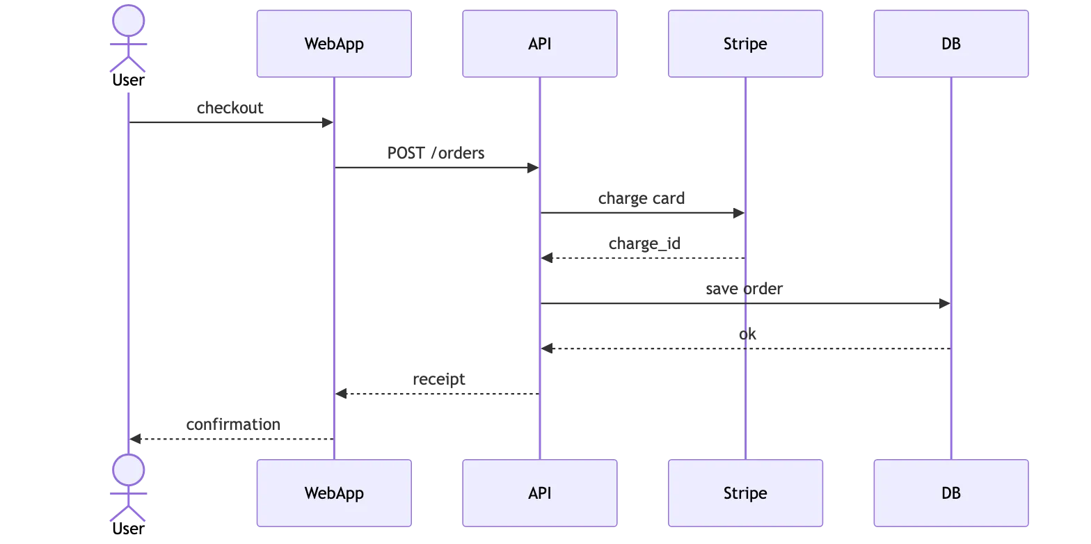
shape: sequence_diagram

User -> WebApp: checkout
WebApp -> API: POST /orders
API -> Stripe: charge card
Stripe -> API: charge_id
API -> DB: save order
DB -> API: ok
API -> WebApp: receipt
WebApp -> User: confirmation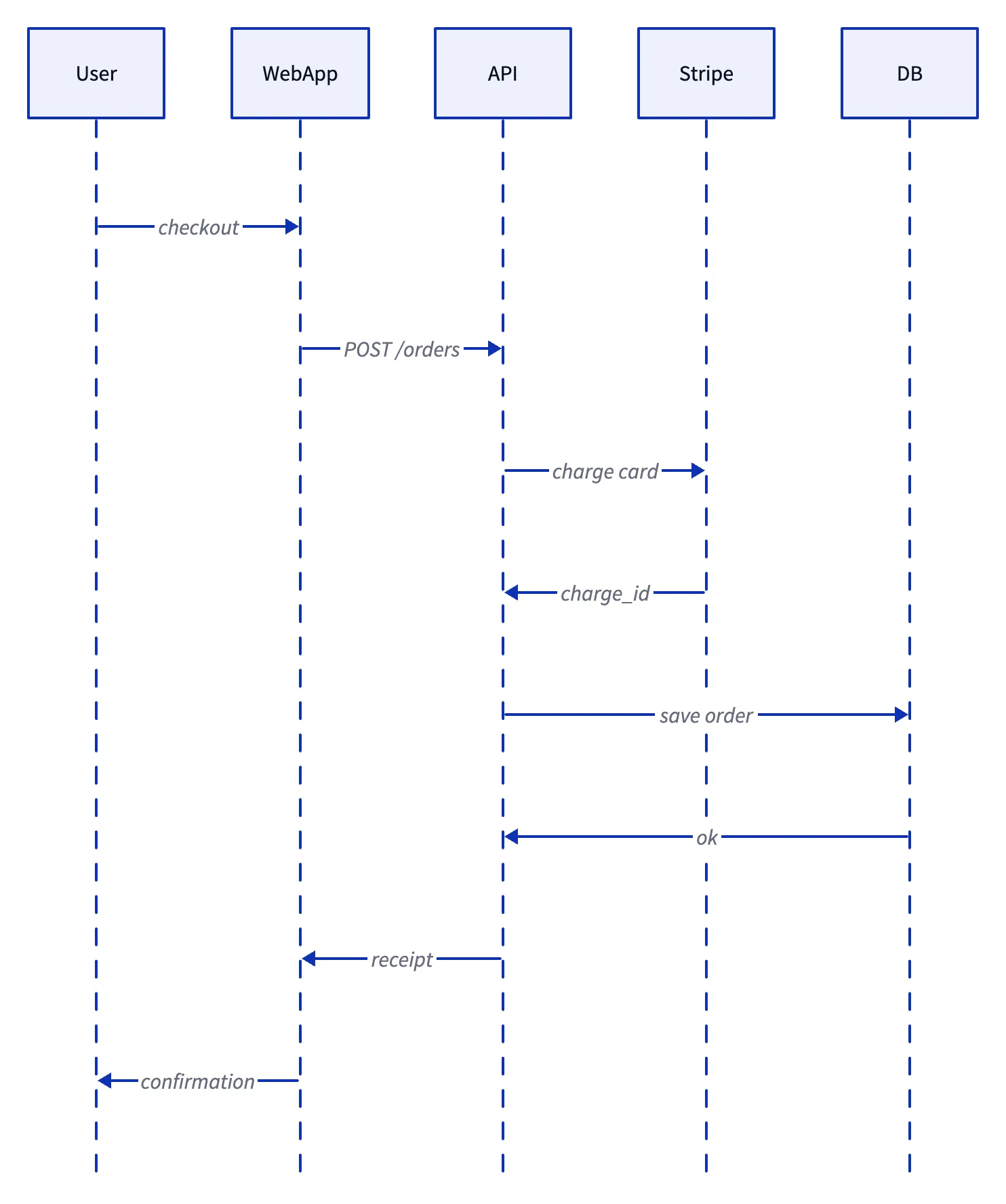
@startuml
actor User
participant WebApp
participant API
participant Stripe
database DB

User -> WebApp: checkout
WebApp -> API: POST /orders
API -> Stripe: charge card
Stripe --> API: charge_id
API -> DB: save order
DB --> API: ok
API --> WebApp: receipt
WebApp --> User: confirmation
@enduml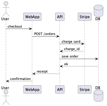
Flowchart
Docs ↗A decision flow. DGMO infers shapes from brackets — no manual declarations needed.
flowchart TD
    A[Request] --> B{Authenticated?}
    B -->|Yes| C[Load Dashboard]
    B -->|No| D[Show Login]
    D --> E[Enter Credentials]
    E --> B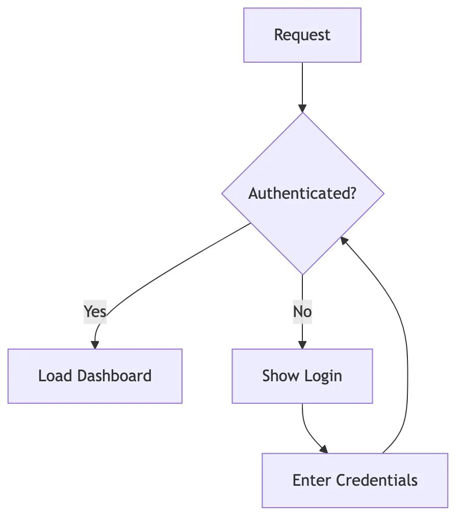
Request -> Authenticated?
Authenticated? -> Load Dashboard: Yes
Authenticated? -> Show Login: No
Show Login -> Enter Credentials
Enter Credentials -> Authenticated?

Authenticated?.shape: diamond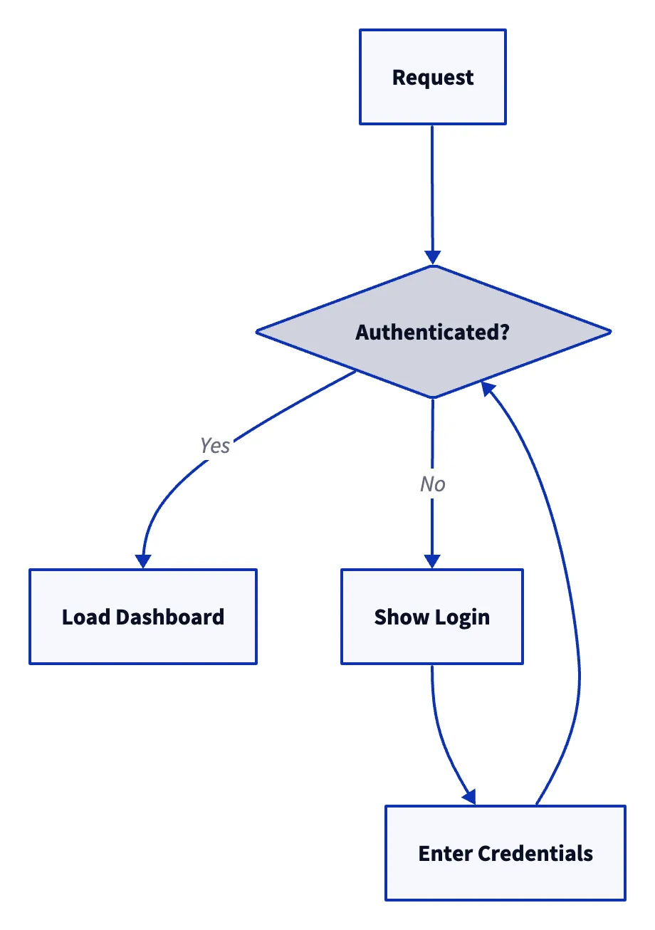
@startuml
start
:Request;
if (Authenticated?) then (Yes)
  :Load Dashboard;
else (No)
  :Show Login;
  :Enter Credentials;
  :Retry;
endif
stop
@enduml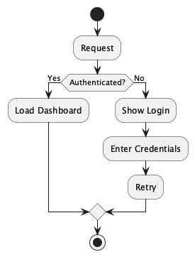
Class diagram
Docs ↗An abstract shape hierarchy with an interface. DGMO uses natural keywords — abstract, interface, extends X implements Y — instead of separate arrow declarations.
class

abstract Shape
  + area(): number
  + perimeter(): number

interface Drawable
  + draw(): void

Circle extends Shape implements Drawable
  - radius: number
  + area(): number
  + draw(): void

Rectangle extends Shape implements Drawable
  - width: number
  - height: number
  + area(): number
+ draw(): voidclassDiagram
class Shape {
<<abstract>>
+area() number
}
class Circle {
-radius: number
}
class Rectangle {
-width: number
-height: number
}
Circle --|> Shape
Rectangle --|> Shape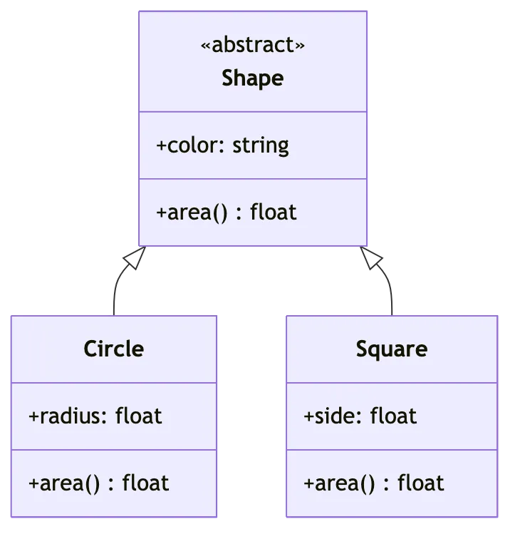
MyShape: {
  shape: class
  +area(): number
}

MyCircle: {
  shape: class
  -radius: number
}

MyRectangle: {
  shape: class
  -width: number
  -height: number
}

MyCircle -> MyShape: extends
MyRectangle -> MyShape: extends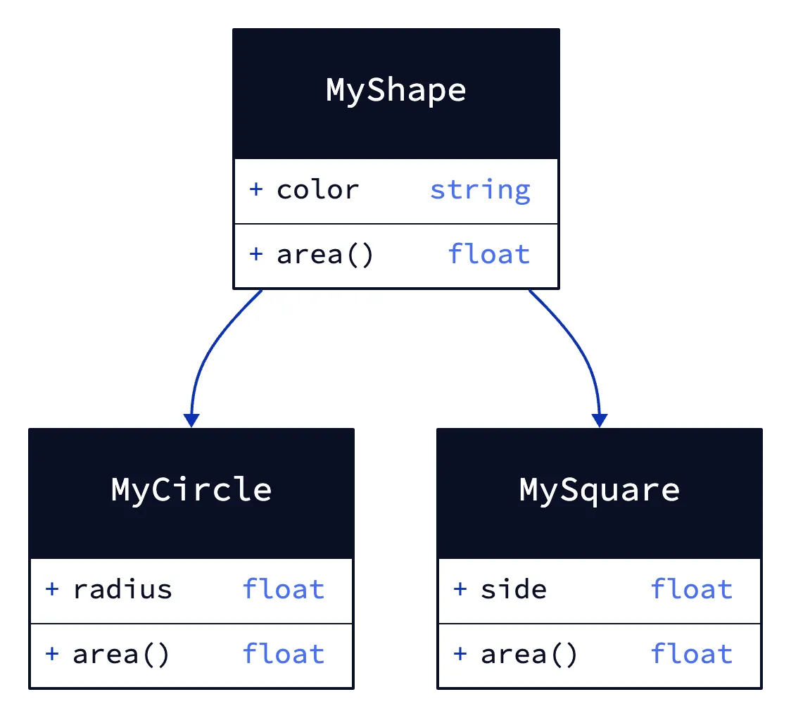
@startuml
abstract class Shape {
    +area(): number
}

class Circle {
    -radius: number
}

class Rectangle {
    -width: number
    -height: number
}

Circle --|> Shape
Rectangle --|> Shape
@enduml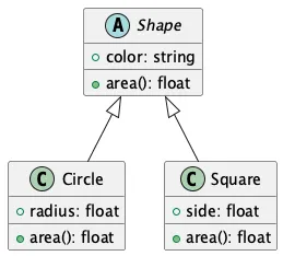
Timeline
Docs ↗The same product timeline in both tools. DGMO's event-line places every event on a real date axis — with phase eras, owner colors, annotated cards, and a live now marker. Mermaid's timeline has no time axis: every entry collapses into an equal-width bucket, with no owners, annotations, or now-marker.
event-line Project Atlas
no-box

tag Owner as o
  PM orange
  Design purple
  Eng blue
  QA green

[Discovery]
  2026-01-08 Kickoff  o: PM
    Charter signed; a three-team squad forms around the Atlas bet.
  2026-02 User research  o: Design
    18 interviews surface the core workflow gap.
  2026-02-28 PRD signoff  o: PM

[Build]
  2026-03 Wireframes  o: Design
  2026-04 Sprint cycles  o: Eng
    Biweekly ship train, feature-flagged behind the Atlas cohort.
  2026-05 QA hardening  o: QA
  2026-06-01 Code freeze  o: Eng
  2026-06-10 MVP demo  o: PM

[Launch]
  2026-08-01 GA launch  o: PM
    Public availability; docs and pricing go live.
  2026-09-15 First $1M ARR  o: PM

nowtimeline
title Project Atlas
section Discovery
2026-01 : Kickoff : User research
2026-02 : PRD signoff
section Build
2026-03 : Wireframes
2026-04 : Sprint cycles
2026-05 : QA hardening
2026-06 : Code freeze : MVP demo
section Launch
2026-08 : GA launch
2026-09 : First $1M ARR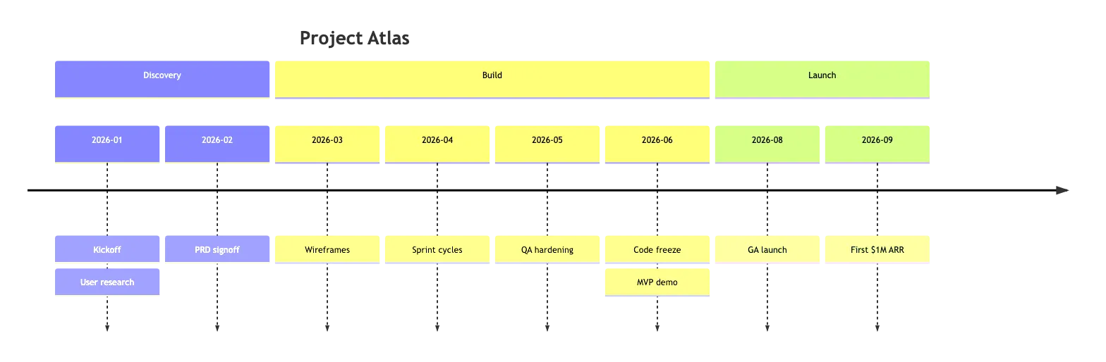
DGMO exclusives
Diagram categories competitors don't cover natively — only DGMO is shown.
Org chart
Docs ↗Reporting structure with department tags driving the colors. Mermaid, D2, and PlantUML have no dedicated org chart type — the closest is PlantUML's work-breakdown (WBS) tree or a mindmap.
User journey
Docs ↗A persona's experience across phases — emotion curve, pain points, score-driven coloring. Mermaid's journey type renders only a bar chart of emoji ratings.
journey-map First PR

persona Junior Engineer
  Joined 2 weeks ago, eager to prove herself

tag Channel as ch
  IDE purple
  Slack blue
  Web teal

[Onboarding]
  Run install score: 2, emotion: Confused, ch: IDE
    pain: Three Node versions referenced in docs
    opportunity: Single bootstrap command
  Pair with mentor score: 5, emotion: Energized, ch: Slack
    thought: The codebase finally clicks

[Review]
  Wait for review score: 2, emotion: Anxious, ch: Slack
    pain: 3-day silence with no SLA
    opportunity: Stale-PR bot pings after 24h
  Get approval score: 5, emotion: Triumphant, ch: Web
thought: I belong hereKanban
Docs ↗A sprint board with two color dimensions: column status and card-priority tags. Mermaid added a kanban type with its own priority key, though not column theming.
PERT
Docs ↗A project network with three-point estimates (optimistic / most-likely / pessimistic) per activity. The renderer runs Monte Carlo automatically: each node's fill saturates with its criticality index — the fraction of trials where it sits on the longest path. Saturated nodes are reliably on the critical path; light tints have slack. Title shows P50 / P80 / P95 completion percentiles, and zero-duration milestones render as ◆ sync points. No competitor offers anything in this category.
pert Pirate Voyage to the Atoll
time-unit w
default-confidence medium

voyage approved 0
  -> recruit crew

[outfit ship]
  recruit crew 1 2 4 as rc
    -> load powder
  careen hull 1.5
    -> load powder
  load powder 0.5 1 2
    -> sail to atoll

sail to atoll 5
  -> count gold
  -> repair hull

count gold 1 2 3
  -> divvy shares

repair hull 3
  -> divvy shares

divvy shares 1 2 3Tech radar
Docs ↗A ThoughtWorks-style technology adoption radar with a four-column blip legend (rendered by default; suppress it with no-blip-legend). No competitor offers anything in this category.
tech-radar Engineering Radar Q1 2026

rings
  Adopt
  Trial
  Assess
  Hold

Languages quadrant: top-left
  TypeScript ring: Adopt, trend: stable
  Rust ring: Adopt, trend: up
  Python 3.12 ring: Adopt, trend: stable
  Go ring: Trial, trend: stable
  Zig ring: Assess, trend: new
  CoffeeScript ring: Hold, trend: down

Tools quadrant: top-right
  Vite ring: Adopt, trend: up
  Vitest ring: Adopt, trend: stable
  pnpm ring: Adopt, trend: stable
  Claude Code ring: Adopt, trend: new
  GitHub Copilot ring: Adopt, trend: stable
  Bun ring: Trial, trend: up
  Turborepo ring: Trial, trend: stable
  Cursor ring: Trial, trend: new
  Webpack ring: Hold, trend: down
  Jest ring: Hold, trend: down

Platforms quadrant: bottom-right
  Cloudflare Workers ring: Adopt, trend: up
  Tauri 2 ring: Adopt, trend: up
  Postgres 16 ring: Adopt, trend: stable
  Neon ring: Trial, trend: up
  Vercel Edge ring: Trial, trend: stable
  Kubernetes ring: Trial, trend: stable
  Fly.io ring: Assess, trend: new
  Heroku ring: Hold, trend: down

Techniques quadrant: bottom-left
  Trunk-based Development ring: Adopt, trend: stable
  Continuous Deployment ring: Adopt, trend: stable
  Feature Flags ring: Adopt, trend: up
  Monorepos ring: Adopt, trend: stable
  AI Pair Programming ring: Trial, trend: up
  GitOps ring: Trial, trend: stable
  Local-first Apps ring: Assess, trend: new
  Server Components ring: Assess, trend: up
Microservices ring: Hold, trend: downRACI matrix
Docs ↗A tasks × roles responsibility matrix with author-time linting. The same chart type covers RACI, RASCI, and DACI variants — variant is inferred from the markers used or locked with a variant-* directive. Per-role and per-phase color let one chart double as a workstream timeline. No competitor offers anything in this category.
raci Voyage Operations
roles
  Cap  color: red
  QM   color: orange
  Bos  color: yellow
  Nav  color: blue
  Crew color: gray

[Departure] color: teal
  Plot the course
    Cap: A
    Nav: R
    QM: C
  Provision the hold
    QM: A R
    Cap: C
    Crew: I

[At Sea] color: purple
  Stand the watch
    Bos: A
    Crew: R
  Mend sail damage
    Bos: A
    Crew: R

[Landfall] color: green
  Negotiate with port
    Cap: A R
QM: CMap
Docs ↗Geographic concept maps — highlight regions, drop points of interest, and connect them with routes or links. Basemap, viewport, projection, and color ramp are all inferred from the content you reference; a bare map already draws coastlines, relief, and labels. No competitor offers a maps chart type at all.
map The Brethren's Caribbean

tag Port as p
  Home Port red
  Friendly green
  Spanish Prize orange

poi Kingston p: Home Port, value: 120
poi Havana p: Spanish Prize, value: 90
poi Santo Domingo p: Friendly, value: 70

route Kingston
  ~weigh anchor~> Havana
  ~raid the galleons~> Santo Domingo
~careen & resupply~> KingstonMore DGMO-only types
Every type below is something no competitor renders at all. We don't show them all in full above — each links to its docs.
Life
Business
Compare by tool
How DGMO stacks up against each alternative, and where each one is the better pick.
DGMO vs Mermaid
Looking for a Mermaid alternative with better layout? Larger Mermaid diagrams can end up with crossing edges and overlapping labels, though its layout is pluggable across several engines and often tunable. DGMO is built around a placement-search layout engine that keeps larger diagrams readable, uses less boilerplate, and covers a far wider range of data charts from the same language.
- ✓Cleaner layout at scale — the layout engine actively minimizes edge crossings instead of leaving you to a single auto-layout pass.
- ✓Less boilerplate — no wrapper keywords or quoting ceremony; the same diagram is usually fewer lines.
- ✓Data charts included — bar, line, pie, scatter, sankey and more from the same language, and many more types than Mermaid carries.
Where Mermaid wins: Mermaid still wins for native rendering in GitHub and GitLab READMEs.
See the same sequence diagram in bothDGMO vs PlantUML
PlantUML's usual distribution is a Java jar that needs a JRE, and its default styling looks dated. (Fair warning: they shipped a JavaScript build in 2026, so the Java requirement is no longer absolute — but the jar is still how most installs run it.) DGMO ships as a single CLI and npm package with modern themed output and a more concise syntax, while still covering the practical UML subset (sequence, class, state, ER, C4).
- ✓Install the CLI or npm package and render — no JVM, no classpath, nothing to keep alive.
- ✓Modern output — themed light/dark with 7 color palettes out of the box.
- ✓Concise syntax — less ceremony than PlantUML’s @startuml / @enduml blocks and skinparam tuning.
Where PlantUML wins: PlantUML wins for UML-complete formality — use case, activity, deployment, and timing diagrams.
See the same class diagram in bothDGMO vs D2
Comparing D2 and DGMO? D2 produces good-looking architecture diagrams but renders natively nowhere — GitHub, GitLab, and Notion all need a build step — and it has no chart-type concept, so a data chart or a map is out of scope for it entirely. DGMO covers far more chart types, including data charts and project and business diagrams, from one concise language.
- ✓Broader coverage — 50 chart types including data charts, Gantt, journey maps, and tech radar; D2 focuses on box-and-arrow diagrams.
- ✓Interactive output — SVG with click-to-source navigation.
- ✓One language — diagrams and data charts share the same syntax, themes, and palettes.
Where D2 wins: D2 wins for deeply-nested container architectures — its auto-layout handles multi-level grouping more elegantly, though its best engine (TALA) is a paid, closed-source add-on.
See the same flowchart in bothDecide
Honest verdicts: when to pick each tool, where DGMO falls short, and answers to common questions.
When to use what
Honest recommendations. Every tool has its strengths.
DGMO
Concise syntax, beautiful rendering, interactive presentations, data charts
If you want the least boilerplate, dark-themed output, and a single language for both diagrams and data charts, DGMO is built for that.
Mermaid
GitHub/GitLab native rendering, maximum community support
If your diagrams live in GitHub READMEs or you need the largest ecosystem of integrations, Mermaid is the established choice.
D2
Container and architecture diagrams with auto-layout
D2 excels at nested container layouts and has a polished Go CLI. Great for infrastructure and architecture diagrams.
PlantUML
Existing team usage, deep IDE integrations, UML-strict diagrams
PlantUML has been going since 2009, with the integration surface that buys. If your team already uses it, switching may not be worth it.
Where DGMO is weaker
No tool wins everywhere. Here's where the alternatives are honestly stronger.
GitHub / GitLab native rendering — Mermaid wins
Mermaid renders inline in GitHub READMEs, issues, PRs, and GitLab. DGMO doesn't — you have to render to SVG or PNG with the CLI and embed the image. If your diagrams live in markdown that's read on GitHub, Mermaid is the lower-friction choice.
UML-strict diagrams (use case, activity, deployment, timing) — PlantUML wins
PlantUML documents nine of the UML 2.x diagram types, including use case, activity, object, deployment and timing — and goes past UML into Archimate, Salt wireframes, EBNF and regex syntax diagrams, rendered JSON and YAML, and directory trees. DGMO covers the practical subset (sequence, class, state, ER, C4) but doesn't aim to be a UML-complete tool. If your team is committed to UML formality, PlantUML has been at it since 2009 and it shows.
Auto-layout for nested container architectures — D2 wins
D2's layout engines handle deeply-nested container/group hierarchies more elegantly than DGMO. If you're drawing complex architecture diagrams with multiple levels of grouping, D2's auto-layout is more polished — worth knowing that TALA, the engine that does this best, is a paid closed-source add-on and watermarks its output without a licence, so the free comparison is against ELK and Dagre.
Export formats — D2 wins
D2 exports to PDF, PPTX, GIF and ASCII as well as the usual SVG and PNG. DGMO does none of those. If your diagrams have to land in a slide deck, an animated GIF, or in a terminal or a plain-text file, that is a real gap and there is no workaround on our side. D2's own docs still call the ASCII output beta, and it renders only under the ELK and TALA layout engines rather than the default Dagre.
Frequently asked questions
What is the difference between DGMO and Mermaid?
DGMO uses a more concise syntax with less boilerplate, covers a much wider range of data chart types, and produces interactive SVG output with click-to-source navigation. Mermaid does ship some data charts of its own — pie, XY, sankey, radar, treemap, quadrant — so the difference is breadth rather than presence. Mermaid has broader ecosystem support, including native rendering in GitHub and GitLab.
Is DGMO free?
Yes — everything is free. The CLI, npm library, online editor, MCP server, and desktop app are all free to use with no trial or subscription.
Can I use DGMO in GitHub READMEs?
Not natively. GitHub renders a short list of syntaxes inline — Mermaid, GeoJSON, TopoJSON and ASCII STL — and DGMO is not among them. You can use the dgmo CLI in CI to render diagrams to SVG or PNG and embed the images in your README.
Does DGMO support dark mode?
Yes. DGMO has built-in dark and light themes, plus 7 color palettes (Slate, Atlas, Blueprint, Tidewater, Nord, Catppuccin, and Tokyo Night).
Is DGMO a good Mermaid alternative?
Yes — especially if you have hit crossing edges or overlapping labels on a larger diagram. DGMO uses a placement-search layout engine designed to keep bigger diagrams readable, has more concise syntax, and covers many more chart types. Two things to weigh honestly: Mermaid renders natively in GitHub and GitLab and DGMO does not, and Mermaid's layout is pluggable across several engines, so a bad result there is often a configuration away from a better one.
Can I use DGMO instead of PlantUML without installing Java?
Yes — though the gap narrowed in 2026. PlantUML's usual distribution is a Java jar needing a JRE, and that is still how most installations run it; they now also publish a JavaScript build that renders without one. DGMO has been a CLI and npm package throughout, plus a desktop app and online editor, so there is no JVM or server to manage either way. It covers the common UML diagrams (sequence, class, state, ER, C4) with modern themed output, though it is not a full UML 2.x tool.
DGMO vs D2 — which should I use?
Use D2 if you mainly draw nested container or architecture diagrams and want its polished auto-layout. Use DGMO if you want a much wider range of chart types — data charts, project, and business diagrams — from one concise language, plus interactive click-to-source output.